Plans & designs to make tech better
Product Strategist • Advisor • Developer
Interface Designer • Drawer • Brander
I don't like pop ups, tooltips, mouseover menus, and information popups used in the design of software and websites.
On Windows 95 and 98 I used a program called TweakUI to disable tooltips throughout the operating system, but I miss it when using Windows 7. So I don't think I have ever really liked tooltips or mouseovers, but having used iOS for a couple years now I feel even stronger about this. I feel that tooltips or anything that automatically pops up in a little window or changes the interface when you move your mouse over it is distracting to the user interface and gets in the way of the user interacting with the computer. I think if software and websites were designed completely without mouse rollover effects and tooltip popups that the user's experience with computers would benefit greatly.
Continued... >
I think it may be best to make all hardware and software buttons and elements slightly rounded squares and rectangles instead of circles or pill shaped stadiums, except for uncommon elements with a specific purpose like circular dials or gauges.
What
- Circles or round images may be better for looking at or more pleasing to the eye for untouchable objects, and can make some of the better looking logos or icons, which can be used within certain buttons or key elements to label some of them with a pleasing image
- Slightly rounded squares and rectangles may be better for encapsulating information and selecting items or touchable objects within practically all user interface elements such as buttons, keys, menu items, tabs, dropdowns, search boxes, etcetera
Why
- Most importantly, slightly rounded squares and rectangles are better shapes for clicking easily and efficiently using any input method, including precise ones like a mouse cursor
- They more accurately portray their clickable area and economically take up more usable surface area available to them, making them quicker to navigate with less missed clicks
- They fit together and look more natural next to each other while also resulting in less wasted space between them, or even no wasted space when connected with a thin line
- They more naturally and adequately fit various content like text and images of all shapes within their boundaries, allowing content to be larger and show more than in a circle
- They match each other better since all are similarly shaped, as well as the surrounding elements including boxes, panels, windows, or borders which cannot be circles or pills
- They are uniform objects with four equal corners, which are pleasing to the eye and natural looking as buttons or any other elements within the overall user interface
I think Google Docs and Sheets should both allow users to directly view, create, edit, and perform other actions on all folders and files within Google Drive, and display these folders as the primary tab or home page in the application, with recent documents a separate tab.
I wonder if Dye & Durham should change its name to a single, short, recognizable word that sounds like it's spelled, possibly with Inc or Software after brand name. I wonder if stock may have performed weakly at least partly due to the length and weakness of brand name.
Imagine if Apple releases a newly redesigned thin and light MacBook Air with a twisting hinge like the Lenovo ThinkBook Twist, a touchscreen display possibly with 120Hz, and the first 2nm M6 chip in 2026, and saves the MacBook Pro touchscreen redesign for the M7 Pro in 2027.
Designing software is harder than hardware because changing it is easier.
Long
Designing simple and easy to use hardware is hard because changing it is harder, but designing simple and easy to use software is harder because changing it is easier.
Designing usable software is hard because not using usable standards is easy.
Long
Designing simple, consistent, and easy to use software is hard because carelessly changing or not using simple, consistent, and easy to use layouts and standards for software is easy.
I think Google and search engines may have lost their way when they started using people's location and providing localized results. I want to search the world for the best information when I search for something. If I want local results I'd include location in the search.
- 2026 Nov/Oct - M6 MacBook Air (New Design)
- 2026 Nov/Oct - M6 MacBook Pro (Old Design)
- 2027 Mar/Jun - M6 Pro MacBook Pro (New Design)
- 2028 Mar/Apr - A20 Pro MacBook Neo 2 (Old Design)
- Note - M2 debuted new Air, M4 debuted new iPad Pro
Prefer labelling items using short or abbreviated words with 4-6 letters and 1-2 syllables.
Organize items into groups of exactly 2, 4, or 6 objects using separators or space.
I wonder if one reason rumored M6 MacBook Pro with OLED touchscreen might be redesigned like iPad Pro with camera inside bezels and no hole punch is because touching very edge of large displays in front of you may not work well, unlike a small iPhone you hold steady in your hand.
Since MacBook Neo got A18 Pro, iPad Air and Pro have M1 and later, and touch is likely coming to MacBooks, I wonder if Apple might merge iPadOS into macOS, allow all iPad apps on all Macs, and have macOS install on iPads other than mini that have 128GB and M2, A18 Pro, or better.
- Portable with battery to place anywhere
- Thin screen with hinge style thin stand
- Folds like laptop to move or travel in bag
- Adequate speakers/camera in thin design
- Screen defaults to display analog clock
- Turns screen on when you look at it
February 27, 2026
For anyone who hasn't realized it, like people enjoying the overly complicated tri-fold phone, you could make a regular foldable phone with a wider aspect ratio on the inside screen like an iPad mini or eReader by making the phone wider and shorter on the outside screen.
Outside Screen
Inside Screen
- 2026 Jan - 12.9" MacBook Air M5
- 2026 Jan - 14.2" MacBook Pro M5 Pro (+16.2")
- 2026 Mar - 3X" Display + Mac Studio M5 Pro
- 2026 Jun - 13.3" MacBook A19 Pro
- 2026 Jun - 13.6" M3/M2/M1 Discontinued
- 2026 Oct - 3X" iMac M6 (2027 Mar?)
I appreciate the gusto if this is purely experimental, but I think the design, function, and placement of this separate bottom toolbar in the Music app may be the single worst UI change in macOS 26.
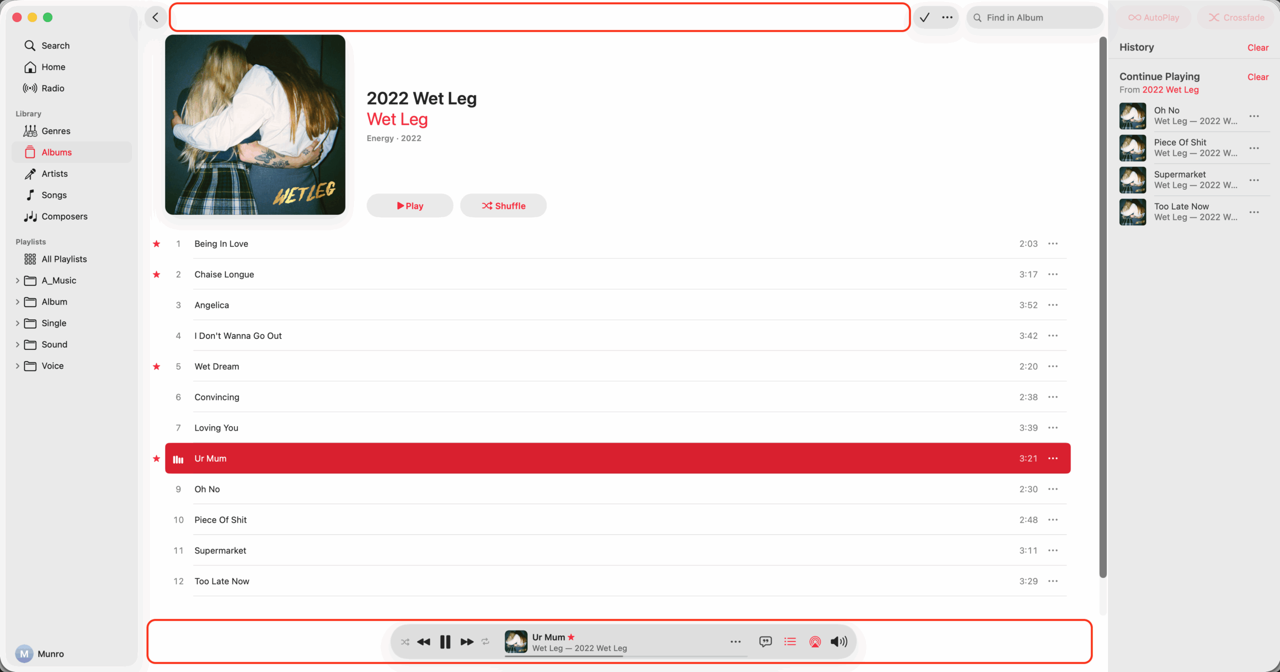
Suggested Changes
- Move and merge the full toolbar back to the top
- Stay in same place when queue or lyrics selected
- Make volume popup from toolbar and have mute
- Collapse volume popup when clicked second time
- Don't blur song title and info when mouse over
- Move star icon to the toolbar and always show
- Make all icons including playback the same size
- Move shuffle to right of playback, left of repeat
I still dislike transparent elements, color changing elements, floating elements, and moving elements in UIs. Imagine if light switch on wall was see-through so hard to see, changed colors so hard to recognize, was covering part of TV, and was in a different spot all the time.
I wonder if the rumor about a MacBook with a new 12.9" screen size might actually be a new M-Series or M5 MacBook Air size and design, with the rumored budget A-Series MacBook being a separate device coming another time in either the current 13.6" design or former 13.3" design.
Budget A-Series MacBook Design
I think it's best to name products using the actual release date in which a product is released, so with Apple's upcoming operating systems I would name them using the current year, such as iOS 25 instead of iOS 26 if it's released in 2025.
