
I appreciate the gusto if this is purely experimental, but I think the design, function, and placement of this separate bottom toolbar in the Music app may be the single worst UI change in macOS 26.
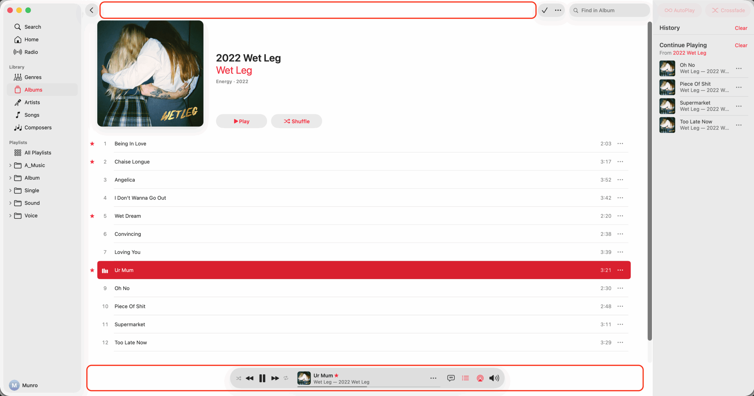
Suggested Changes
- Move and merge the full toolbar back to the top
- Stay in same place when queue or lyrics selected
- Make volume popup from toolbar and have mute
- Collapse volume popup when clicked second time
- Don't blur song title and info when mouse over
- Move star icon to the toolbar and always show
- Make all icons including playback the same size
- Move shuffle to right of playback, left of repeat