
I wonder if one reason rumored M6 MacBook Pro with OLED touchscreen might be redesigned like iPad Pro with camera inside bezels and no hole punch is because touching very edge of large displays in front of you may not work well, unlike a small iPhone you hold steady in your hand.
Category: 📁 Tech Crafts
Plans & designs to make tech better
Product Strategist • Advisor • Developer
Interface Designer • Drawer • Brander
Smart Display Design Ideas
- Portable with battery to place anywhere
- Thin screen with hinge style thin stand
- Folds like laptop to move or travel in bag
- Adequate speakers/camera in thin design
- Screen defaults to display analog clock
- Turns screen on when you look at it
February 27, 2026
Make Foldable With Wider Screens
For anyone who hasn't realized it, like people enjoying the overly complicated tri-fold phone, you could make a regular foldable phone with a wider aspect ratio on the inside screen like an iPad mini or eReader by making the phone wider and shorter on the outside screen.
Outside Screen
Inside Screen

Leave MacOS Toolbars At Top
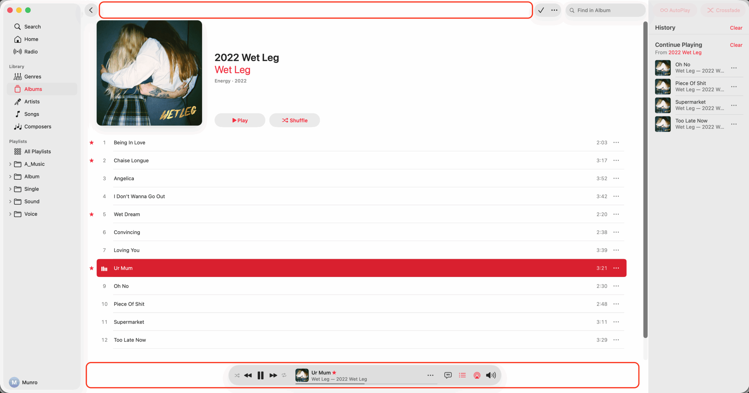
I appreciate the gusto if this is purely experimental, but I think the design, function, and placement of this separate bottom toolbar in the Music app may be the single worst UI change in macOS 26.
Suggested Changes
- Move and merge the full toolbar back to the top
- Stay in same place when queue or lyrics selected
- Make volume popup from toolbar and have mute
- Collapse volume popup when clicked second time
- Don't blur song title and info when mouse over
- Move star icon to the toolbar and always show
- Make all icons including playback the same size
- Move shuffle to right of playback, left of repeat
Create Static Interface Elements
I still dislike transparent elements, color changing elements, floating elements, and moving elements in UIs. Imagine if light switch on wall was see-through so hard to see, changed colors so hard to recognize, was covering part of TV, and was in a different spot all the time.
Display 16 Apps Instead Of 9
I think that Apple or any company making operating systems should display an even amount of 16 apps in home screen tabs, app folders, and app menus on iOS, tvOS, and other operating systems, instead of the hard to organize and odd amount of 9 apps.
What
- Display 16 apps in folders, or alternatively 24
- Grid of 4x4 apps in folders, or alternatively 4x6
- Always show an even amount of app columns
- Always show an even amount of app rows
Why
- Grouping apps in groups of 2, 4, or 6 makes sense logically
- With groups of 4 people can easier create a mental model
- Rotating from portrait and landscape shows the same apps
- People may be buying or using less apps with folders of 9
Design Without Bumps Or Notches
I love the old iPad mini 5 with its completely flat back, no camera bump, and a naturally uniform screen. I dislike the iPhone mini 13 with a wobbly back, humongous camera bump, and imbalanced intrusive notch. While out of style, I wonder if Steve Jobs would feel the same way.
Allow Moving And Removing Finder
I wonder if macOS 16 should allow users to move and remove the Finder app from the Dock, and also include it in the Launchpad and Applications folder. For consistency and simplicity, the Trash folder could allow being moved and removed as well, and be included in the locations section of the Finder.
Make Shortcuts To Cycle Taskbar
I think Windows, macOS, and other desktop operating systems should have 2 simple keyboard shortcuts to switch to the previous and next open apps by the order in which they appear on the taskbar or dock.
Make Apple Camera And Flat iPhone
I wonder if Apple should make a separate smart camera device, and design the base model iPhone with a completely flat back and no camera bump in the future.
Put Bullet Point On Keyboards
I wonder if we should design keyboards to input the bullet point character (U+2022 •) instead of the backtick character (U+0060 `), which is currently the key above the tab key and to the left of the number 1.
Notes
- Why 1 • The bullet point is a very common symbol used in lists and HTML
- Why 2 • The bullet point character is an excellent information separator
- I wonder if the bullet point should be used as a data/table separator
- Column Data 1 • Column Data 2 • Column Data 3 • Column Data 4
- I wonder if the bullet point should be used as a better colon replacement
- Title of This Book • Cool Subtitle of This Book With a Really Long Name
- I wonder if the bullet point could even be used as a filename/URL separator
- Example • 2023-08-20•bullet-point-character-on-keyboards•munro-stewart
August 20, 2023
Spotlight Search Bar In Control Center
Apple should include the Spotlight search bar at the top of the Control Center screen, so it could be accessed like a widget from within any application quicker and easier.
Merge Control Center And Widgets In iOS
Apple should merge Control Center and Widgets in its operating systems, and remove widgets from the home screen or app launcher.
Bumps And Cutouts Be Gone
I wonder if the spirit of Steve Jobs is upset because cameras, including big ugly bumps that aren't flush to the back and notched cutouts that intrude on the display, are ruining the beautiful design and simple form of the once magical and elegant smart phone gadgets of the past.
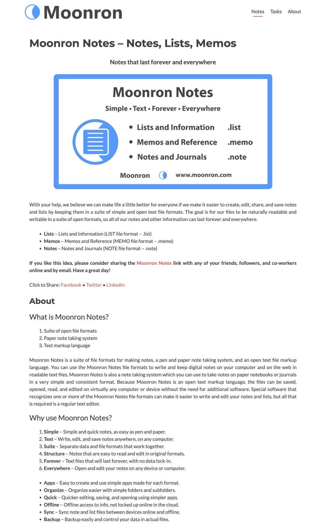
Moonron Brand

December, 2017
Moonron Logo

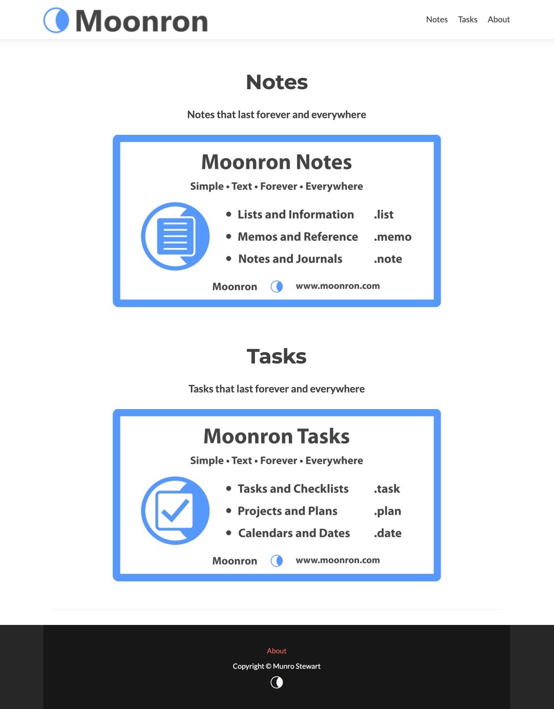
Moonron Site
Notes
About
Make Long Press Work Everywhere
For an equal and consistent UX, iOS should make a long press on older devices work absolutely everywhere a 3D Touch hard press works.
Make App Switchers A List With Icons
I still think that the app switcher in iOS should show icons instead of screenshots, and either have a scrolling horizontal list of icons or a scrolling vertical list with icons to the left of the full app names, instead of displaying one screenshot at a time.
Make Thick Phone With Flat Back
I wonder if Apple should now make an iPhone thicker for huge battery and flush camera. Slim down in future as battery and camera tech improves.
Christina Bonnington on Apple’s iPhone X Strategy - Daring Fireball